Research

Gates n fence is a website about making gates, I have some reasons why it isn't a good website. Firstly the writing is really small which makes it harder to read and people could begin to get fed up of trying to read it. Secondly the information is just dumped on the first page. thirdly everything is badly highlighted and there are to many links on the left hand side. The only interaction is to call them which they put at the top left of the home page which looks horrible. You also cant go back unless you click the back button.
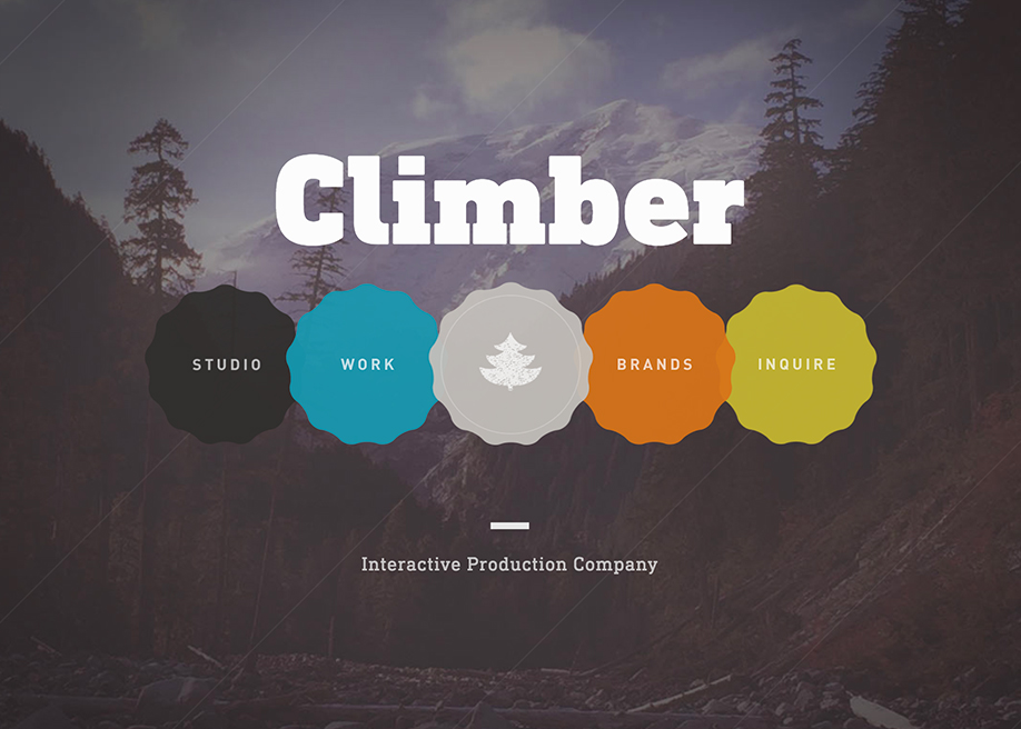
If you compare this to climber.io, climber.io is far more better than gate n fence. Here's why. Climber.io forces you to interact to see the information whereas you just click on gates n fence and the information is just dumped on the front page. Also the design layout is far more better than gates n fence. When you click on one of the circles the page falls into this wave which looks really cool whereas gates n fence just takes you there. Climber.io is also very engaging and fun because its really interactive whereas gat n fence isn't engaging because its not really interactive.
https://andrewjamesspooner.com/
http://www.mattvogel.com/
https://brownlow-pike.co.uk/about/
https://www.maxfulham.co.uk/contact
I've done some research on other puppeteers websites to get an idea of what i can do for my client Conor.

Matt vogel's website was a very good one to look at but i didnt go with the exact design he went with because he has a lot of information on there since he's done more things than conor has. Matt vogel's links at the top of his website take him to different pages whereas on the website im working on its all on the same page and thats how my client wanted it.

Max Fulham's website was another good one to look at and it was also recommended to look at by my client to give me some ideas of what he wanted, he liked the idea of his website being bright and less serious. He still wanted it to look professional and fun so that's what I've tried to do with his website. Again with this website when you click on the links at the top it takes you to a different page whereas my client wanted it all on the same page.

Brownlow-pikes website is different to the other two including my clients website because on the homepage it shows all of the shows hes been in and when you click on them it tells you lots of information about the show. Unfortunately Conor has not done any shows so i cant go with this layout but he is happy with the website layout that i have gone with.
Comments
Post a Comment